Watch Tower
85 years of who arms whom, and what changes when history shifts.
The problem
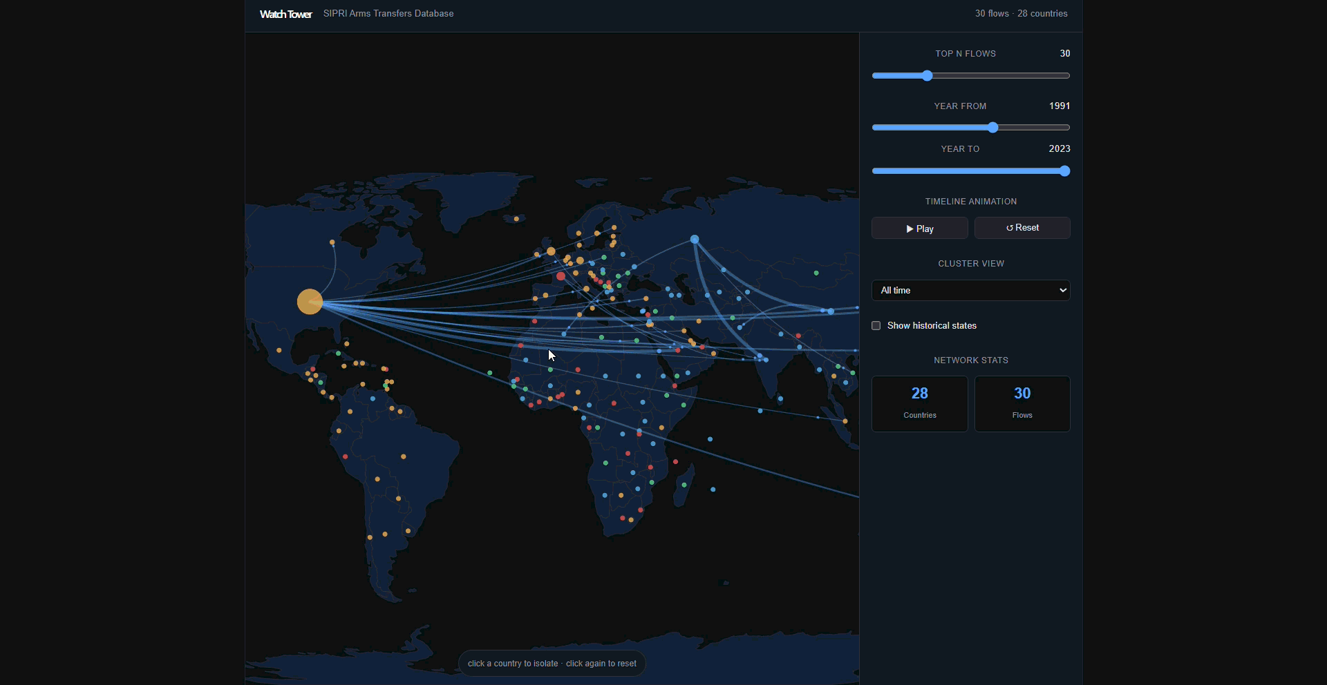
The SIPRI arms transfer database covers every major conventional arms deal from 1940 to the present — supplier, recipient, quantity, year. It's a complete record of how military power has moved around the world for 85 years. But in its raw form it's 150,000 rows of transactions. The story is invisible.
I wanted to make the structure visible: which countries form tight trading blocs, when those blocs fracture, and where the outlier moments are — the years where a country's arms supply suddenly concentrates or diversifies in a way that breaks the pattern.
What I built
A Python ETL pipeline (pandas + Jupyter) cleans and aggregates the raw SIPRI data into a directed graph: 258 nodes (countries), 3,150 edges (supplier→recipient relationships), edge weights proportional to transfer volume. Louvain community detection finds the trading blocs, such as Cold War clusters and post-Soviet realignment.
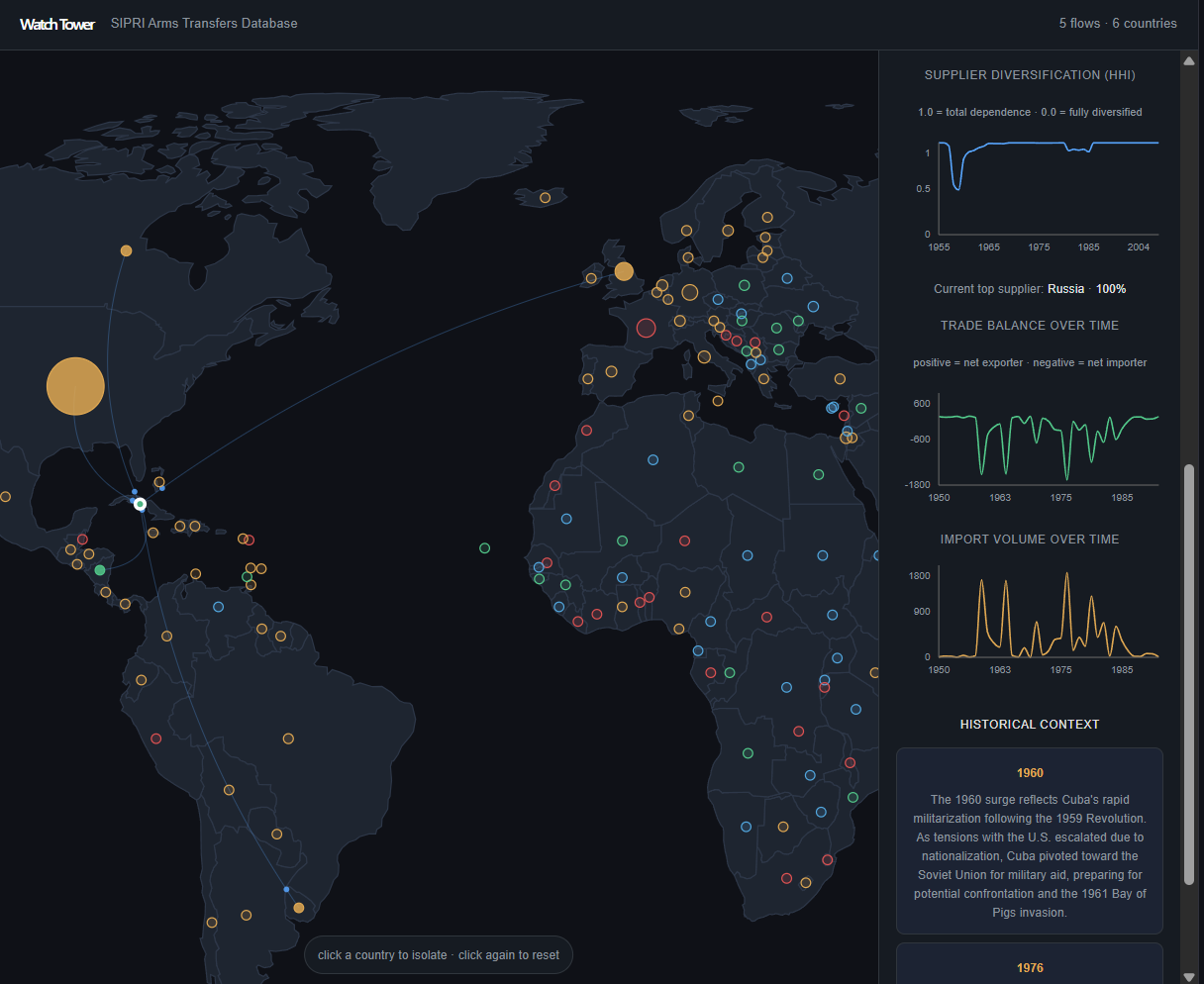
On top of the graph, a Herfindahl-Hirschman Index (HHI) tracks each country's supplier concentration over time. Separately, I computed annual arms import volumes and used a Z-score threshold to identify unusually large spikes or drops relative to a country's historical baseline. This process surfaced 497 anomalies across the dataset. Each anomaly triggered an asynchronous Gemini API call to generate geopolitical context for the country and year. I also cross-referenced the results with UCDP conflict data to evaluate how often major shifts in arms imports coincided with real-world conflicts.
The front end is a React + D3 interactive world map: click a country to see its trade history, HHI trajectory, and flagged anomalies with Gemini context.
The hard part
The original hypothesis was that arms import anomalies would correlate with nearby conflicts — that countries ramp up imports when they're at war, or when neighbors are. The method was clean: flag HHI anomalies, cross-reference with UCDP conflict events within a geographic and temporal window, measure the overlap.
The result: ~28% of anomaly spikes had a nearby conflict — against a baseline of ~27%. Essentially no correlation. The null result forced a better question: if active conflict doesn't drive arms concentration, what does?
Looking at individual cases revealed a different pattern. Cuba's imports surged ahead of the Bay of Pigs invasion, and several Eastern European countries showed similar buildups before periods of instability rather than during them. While the project wasn't designed to test predictive power directly, these examples suggest that arms transfers may reflect strategic positioning and alliance shifts before conflicts become visible in traditional conflict datasets.
What I'll be working on next
The current project analyzes how arms-trade networks evolved. The next step is understanding how resilient those networks are.
Using an agent-based model built with Mesa, I want to simulate countries as agents making supplier-selection decisions based on factors like cost, alliance strength, geographic proximity, and existing trade relationships. By introducing shocks — sanctions, wars, regime changes, or supplier collapses — I can observe how quickly the network adapts and which countries or blocs are most critical to overall stability.