Ontario's Nuclear Floor
I expected a bell curve. I found two grids hiding inside one — and a nightly carbon floor that sits right where Quebec runs all year.
Two grids inside one
When I started plotting Ontario's hourly carbon intensity data, I expected a roughly bell-shaped distribution. Some low hours, some high hours, most clustered somewhere in the middle. That's what you'd expect from a grid that shifts between fuel sources as demand rises and falls through the day.
What I got was this:
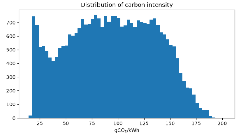
That's not a bell curve. It's two humps — a sharp spike concentrated between 15 and 25 gCO₂/kWh, and a broader mass centered somewhere around 90–120. The two modes barely overlap. Ontario isn't one grid running at variable intensity. It's two grids operating at completely different carbon levels depending on the hour, and the transition between them is abrupt.
Why the floor exists
The spike on the left comes from overnight and weekend off-peak hours. Ontario has roughly 13 GW of nuclear capacity — Darlington, Pickering, and Bruce — and nuclear plants don't ramp. They run flat, 24/7, regardless of what the grid needs. At 3am on a mild Sunday, when Ontario's total load might drop to 11 or 12 GW, nuclear output alone is pushing close to baseline demand. Add in hydro and whatever wind happens to be blowing, and the grid is nearly full on near-zero-carbon sources before gas gets a word in.
But gas doesn't fully disappear even then. Ontario's gas plants provide voltage support in the GTA, spinning reserves for grid stability, and many are subject to minimum-run contract clauses that prevent a complete shutdown. So you still see some gas output, but it's a sliver sitting on top of a near-nuclear foundation. The result is a hard floor around 15–25 gCO₂/kWh that Ontario's grid hits essentially every single night.
The relatively empty region between the two modes — around 35–50 gCO₂/kWh — is the transition zone. Gas is either idling near its minimum or it's meaningfully dispatched to chase demand. There's not much middle ground. Once industrial load picks up in the morning or AC demand rises in summer, you cross into the right-hand hump. Until then, you're on the floor.
Ontario vs. the neighbors
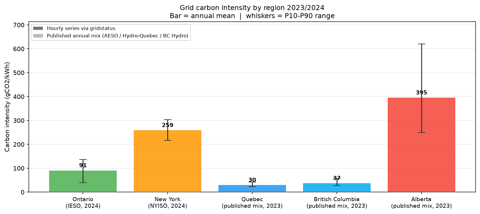
Ontario's mean intensity across 30,216 hourly observations is 91 gCO₂/kWh. New York's is 259. Same latitude, similar climate, similar residential electrification — and Ontario is roughly three times cleaner on average. The P10–P90 bands barely overlap: Ontario's 90th percentile (137 gCO₂/kWh) sits below New York's 10th percentile (216). These are not similar grids with different variance. They're structurally different grids.
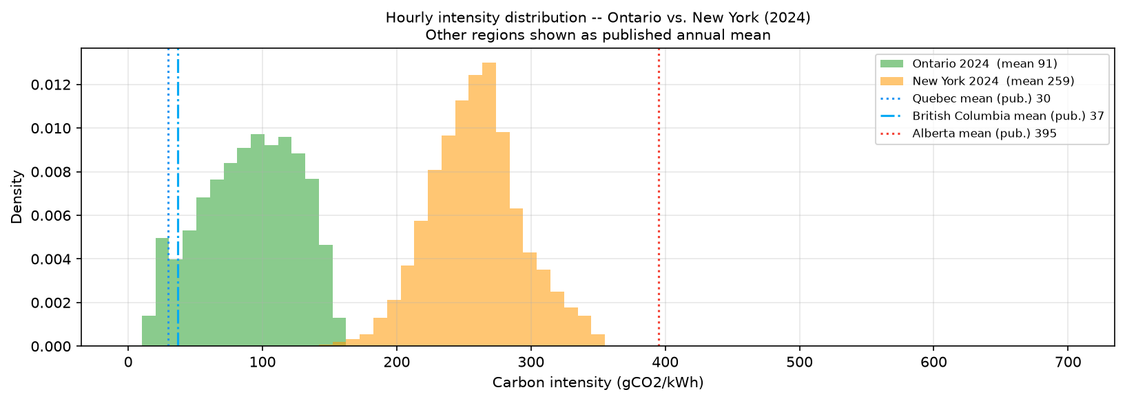
The density plot makes the separation visceral. The Ontario distribution — bimodal, narrow — and the New York distribution — wide, shifted right — have almost no common mass. But the more striking detail is where Ontario sits relative to the vertical lines for Quebec (mean ~30 gCO₂/kWh), British Columbia (~37), and Alberta (~395). During off-peak floor hours, Ontario is running at 15–25 gCO₂/kWh — right on top of where Quebec and BC run all year. On the floor, Ontario looks like a hydro province. Ontario's worst hours (~200 gCO₂/kWh) are still less than half of Alberta's annual average. Worth flagging: Quebec, BC, and Alberta figures come from published annual fuel-mix reports, not hourly data, so those comparisons are mean-to-mean only — the vertical lines don't have whiskers because there's no hourly distribution to draw.
What this means practically
The floor isn't an abstract curiosity. If you charge your EV or run your dryer during Ontario's floor hours — roughly midnight to 6am most nights — you're drawing from a grid at 15–25 gCO₂/kWh. Shift that same load to 6pm on a hot August evening, and the grid is probably north of 150. That's a 6x swing in emissions from the exact same appliance doing the exact same work. Time of use matters even on an already-clean grid.
The load-shifting case gets even stronger when you think about marginal intensity rather than average intensity. The average (91 gCO₂/kWh) reflects the whole grid blended together. But when demand rises, operators dispatch whatever source is cheapest and available — and in Ontario that's almost always a gas peaker. So if you add demand at 6pm on a summer evening, your extra kWh caused a gas plant to turn on. The real carbon cost is closer to 490 gCO₂/kWh, not 91. At 2am it's the opposite: nuclear, hydro, and wind are already covering everything with room to spare. Your extra kWh gets served by generation that was already running — no gas plant needs to turn on because of you. The floor is the only window where average and marginal intensity are roughly the same low number.
Methodology note
All regions use the same lifecycle emission factors for comparability: gas 490, coal 820, nuclear 12, hydro 24, wind 11, solar 41, biofuel 230 gCO₂/kWh. Ontario and New York figures come from real hourly data — IESO for Ontario, NYISO via gridstatus for New York — covering January 2023 through June 2026 (30,216 hourly observations for Ontario). Quebec, BC, and Alberta are reconstructed from published annual fuel-mix reports; no hourly distribution is available, so those comparisons are mean-only. All figures are average intensity, not marginal. Ontario's imports from Quebec and Manitoba are excluded — IESO's generation reports cover in-province output only.